Wingscanner: Upgrade prompt
A well-designed upgrade prompt can help convert (and not annoy) users.
Challenge
Revise an upgrade prompt for WingScanner, a new low-cost airline. They’re offering a new upgrade that lets customers skip airport security lines and enjoy simpler screening.
Scenario
A user is in the process of purchasing flights. They’ve filled in all of the required information and are ready to complete checkout. The final screen that appears before checkout prompts them to purchase this new offer for an extra $20.
Strategy
To encourage users to get the upgrade but also avoid slowing them down in a business-critical moment, I focused on highlighting the benefits in a clear, enticing, and easily scannable way.
What I did
UX writing, mockup (solo exercise)
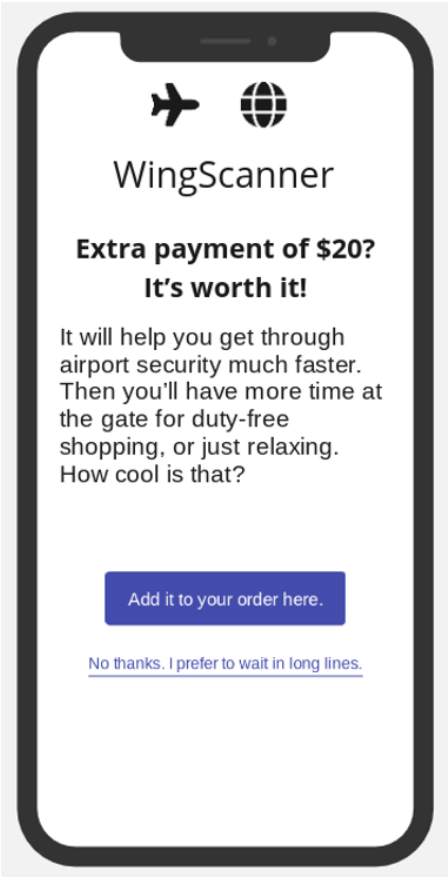
BEFORE
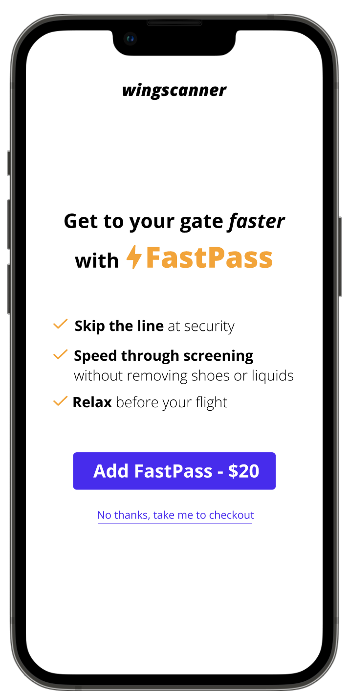
AFTER
Assessing the current copy
I started by analyzing the existing copy to identify potential areas of friction in the user experience.
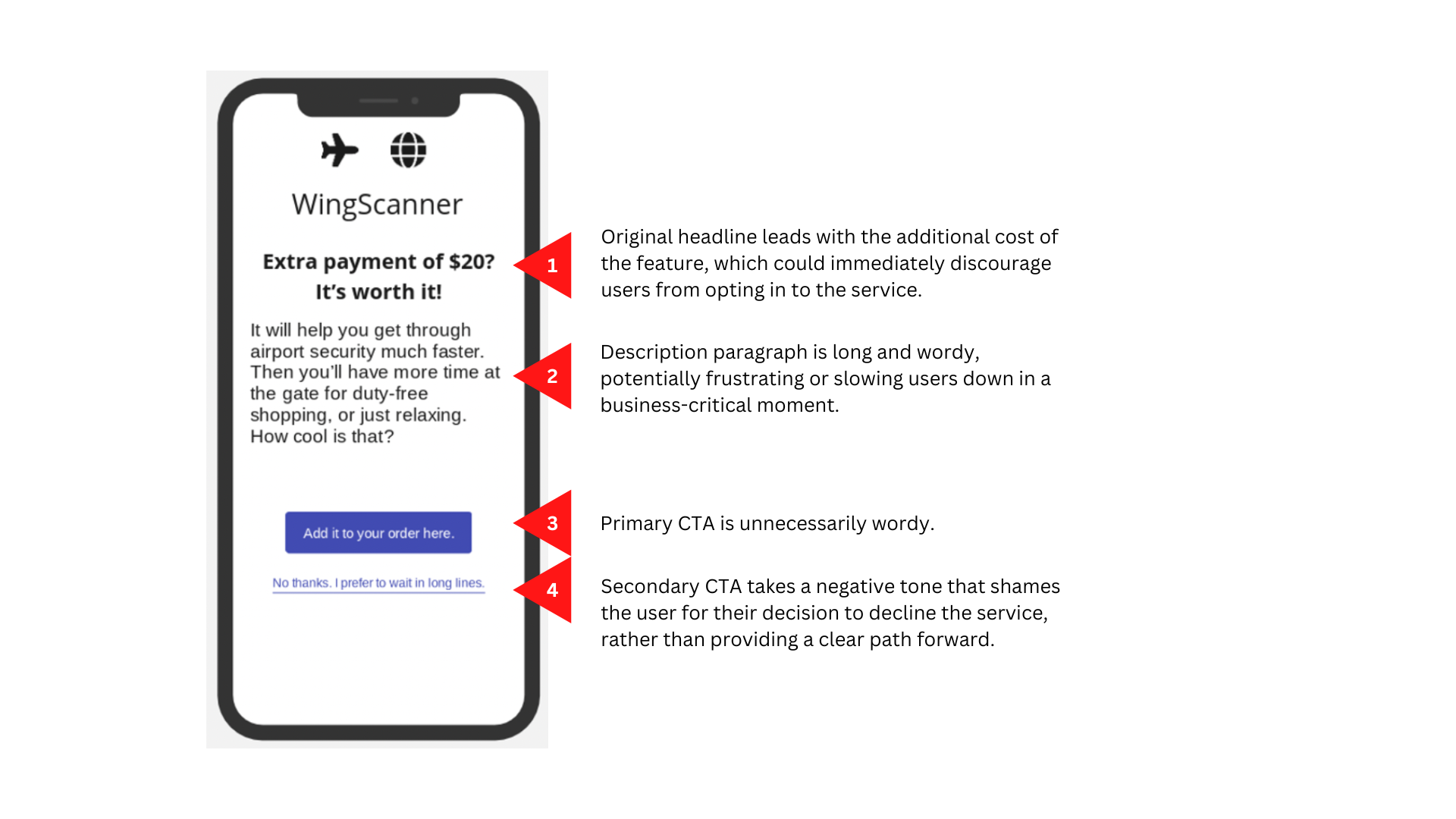
Original screen
Exploring solutions
To encourage users to purchase the upgrade and avoid slowing them down in a business-critical moment, copy needed to get to the point quickly and clearly. I created a copy doc to explore clear, concise ways to communicate the upgrade benefits. View the full copy doc and rationale in Notion.
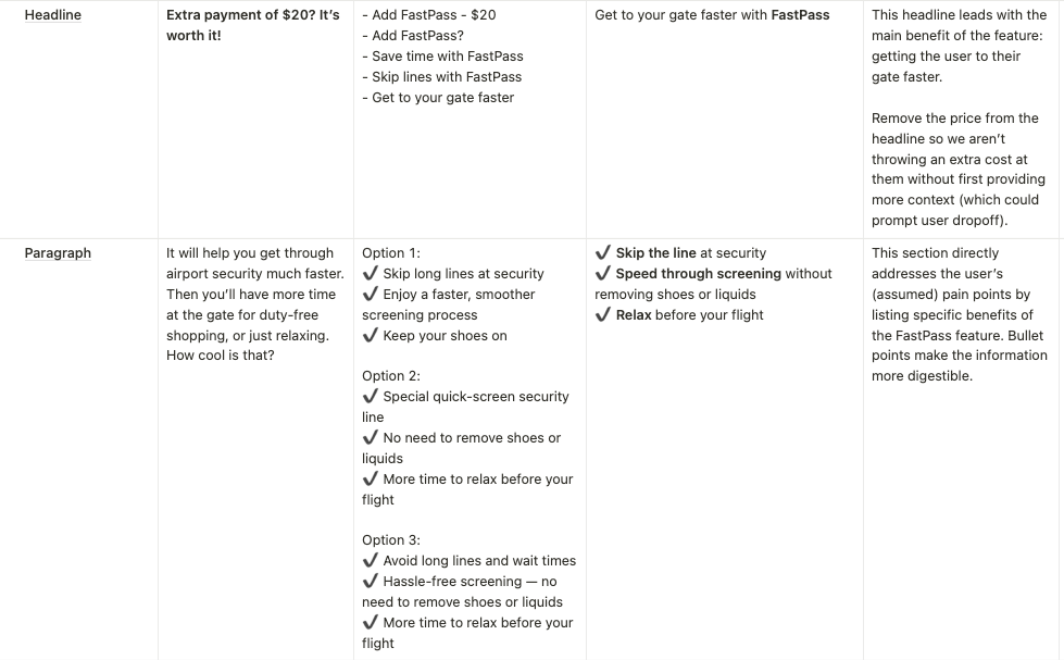
Copy doc
My first revision improved upon the original—helpful CTAs, use of bullet points to reduce cognitive load—but there was still room to edit further for impact and clarity.
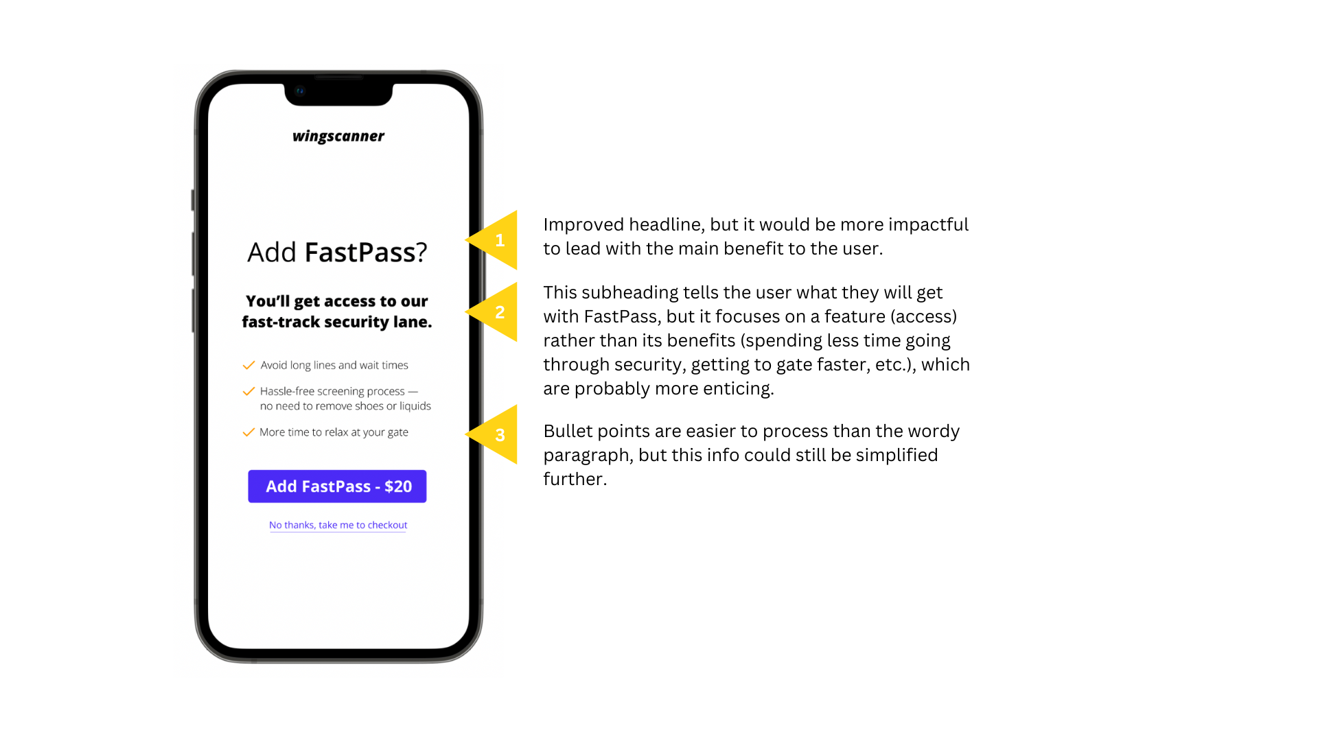
First revision
Final revision
The final version more clearly and concisely communicates the upgrade’s benefits, with helpful CTAs that manage user expectations.
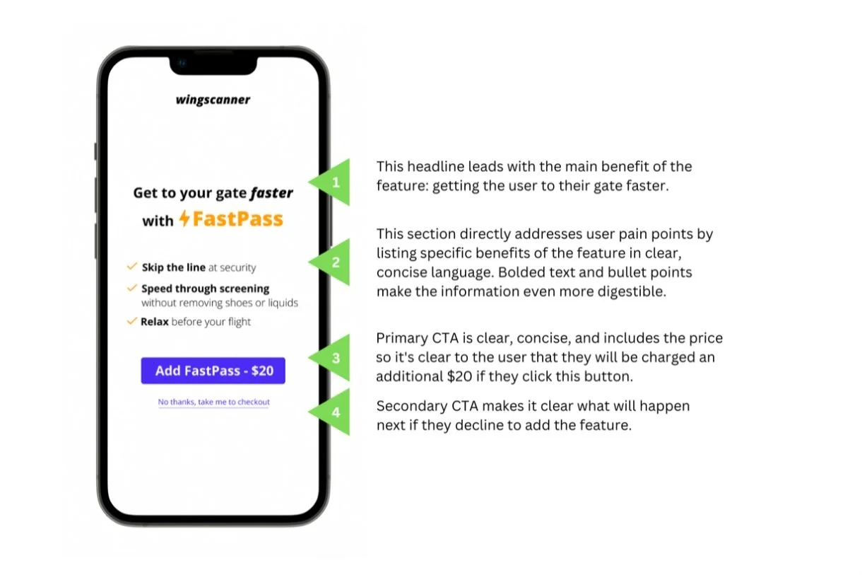
Final revision
What I learned
What users need to know most—and first—is how a product or feature can help them accomplish what they want to do. Lead with that benefit, then follow with the details.
